Conversion Optimization · A/B Testing · 2026

Test it. Read it. Test it again.

Three rounds of A/B testing for an online course subscription business: state-specific paid search pages, the subscription checkout, and the homepage. Most changes won. The ones that didn't were just as useful.

01 · Paid Search

One template, tested in every state.

Every state runs its own paid campaign against a shared landing page. The redesigned template was tested across all of them. The few that dipped had no deadline that month.

Simplified hierarchy State info surfaced sooner Message match to ads Clearer CTA Shorter path to convert
State Original CVR New CVR Change  
Kentucky 1.37%3.62% +164.1%
Kansas 2.65%4.36% +64.5%
New York 0.92%1.42% +54.8%
Florida 2.33%2.79% +19.8%
Missouri 3.25%3.54% +8.6%
Utah 2.90%3.00% +3.1%
Pennsylvania 3.19%2.48% −22.4%
West Virginia 6.82%3.53% −48.2%
6 improved · 2 declined · a sample of the state pages tested
The losses
West Virginia and Pennsylvania went down. Both were already converting well, and both were tested in a month with no deadline coming up, so fewer visitors were ready to sign up.
The wins
Kentucky and New York improved the most. The new page added a box in the top corner showing exactly what that state requires, with quick links to it, so visitors found what they needed right away.
What changed after
The states that improved kept the new page. The ones that dropped were tested again in a month with a deadline, instead of being judged on one slow month.
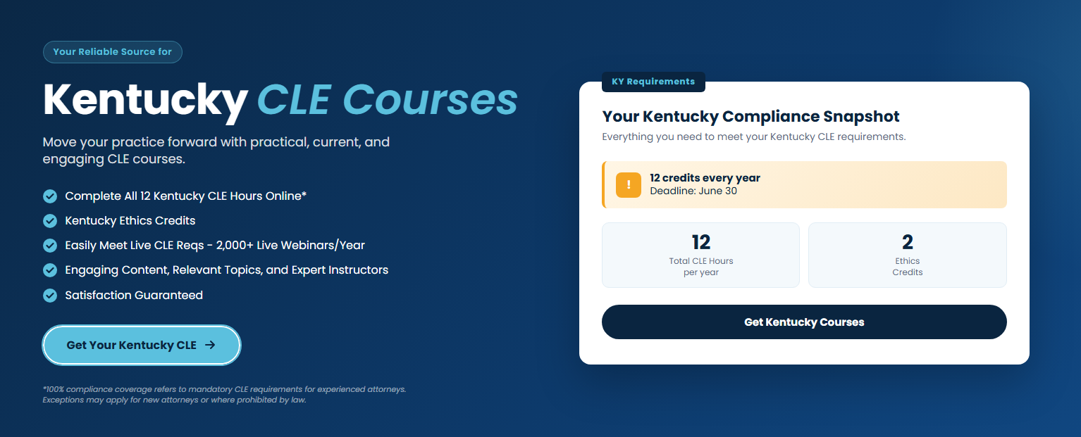
Kentucky · winning variant, +164% CVR
Kentucky paid search landing page, winning variant
02 · Subscription

One checkout, tested continuously.

The subscription page is never really done. It's tested on an ongoing basis, with each result deciding what gets tried next.

Test · CTA copy
Changing the button label nearly doubled conversions

Same layout, same design. Only the button wording changed, from Select Pass to Buy Now.

VariantSessionsConversionsCVR
Select Pass4,864140.29%
Buy Now4,452250.56%

+95.2% conversion rate

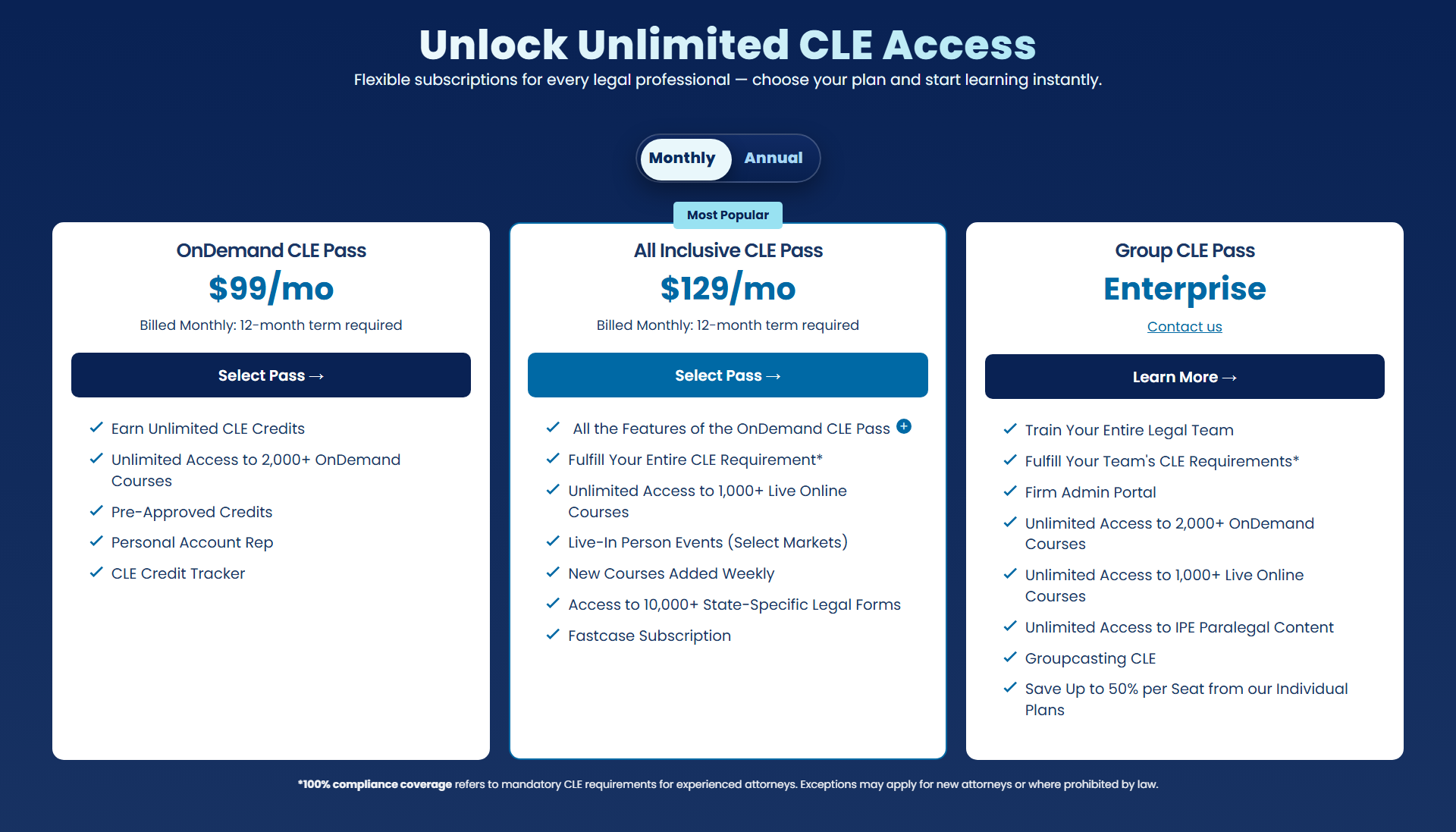
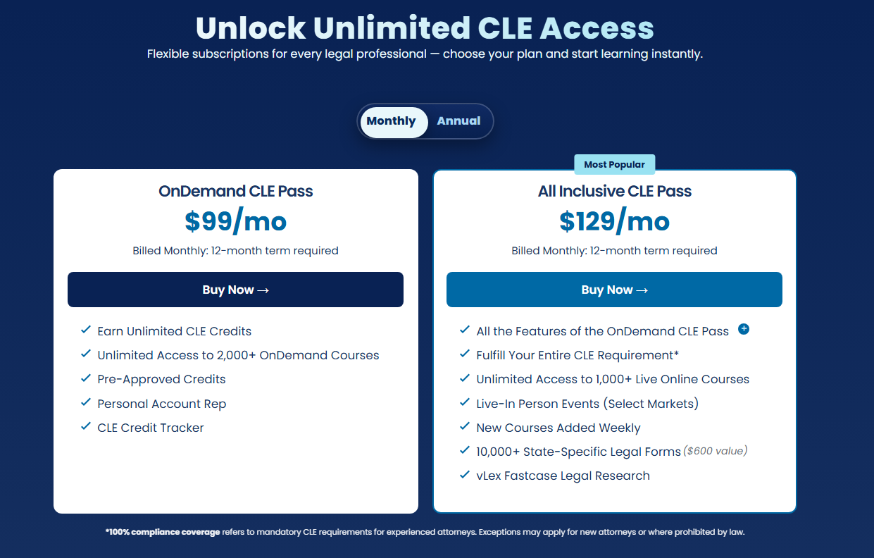
Test · Card hierarchy
Three cards above the fold became two

The third plan moved to its own section lower down, leaving the two most popular passes to carry the fold. Less to weigh, a clearer default.

Before · 3 cards
Subscription pricing with three plan cards above the fold
After · 2 cards
Subscription pricing with two plan cards above the fold
03 · Homepage

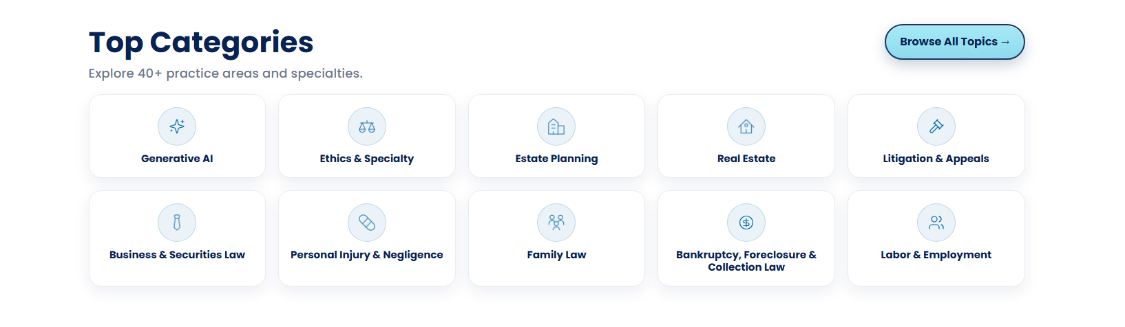
Top Categories, moved above the fold.

The category grid sat mid-page, below a product carousel, where few visitors reached it. Moving it directly under the hero put the most-used entry point where attention already was.

A · Quick links
Let people skip the hunt
Most visitors arrive knowing what they need, so categories became the first thing after the hero.
B · Topic order
Order by demand, not catalog
The grid was reordered by what people actually browse, putting high-intent topics first.
C · Hierarchy
Fewer blocks competing
Dropping the carousel that sat above it gave the categories a clear, uncontested slot.
Homepage with Top Categories moved directly under the hero
CVR
+23.8%
Conversion rate
RPV
+25.8%
Revenue per visitor
ATC
+23.3%
Add to cart
The takeaway

The data decided what shipped.

Across state landing pages, the checkout, and the homepage, every change was one hypothesis tested against real traffic. The pages that dipped weren't failures. They marked where a redesign wasn't the lever, or where timing mattered more than layout.

More work by Molly Curtis

View More Landing Pages →