Turn a confusing pricing page into a conversion machine.
The page was dense, visually overwhelming, and asked visitors to make too many decisions before they even understood what they were buying.
I identified the problem on my own, built the case for a redesign, and executed the new page from strategy through launch.
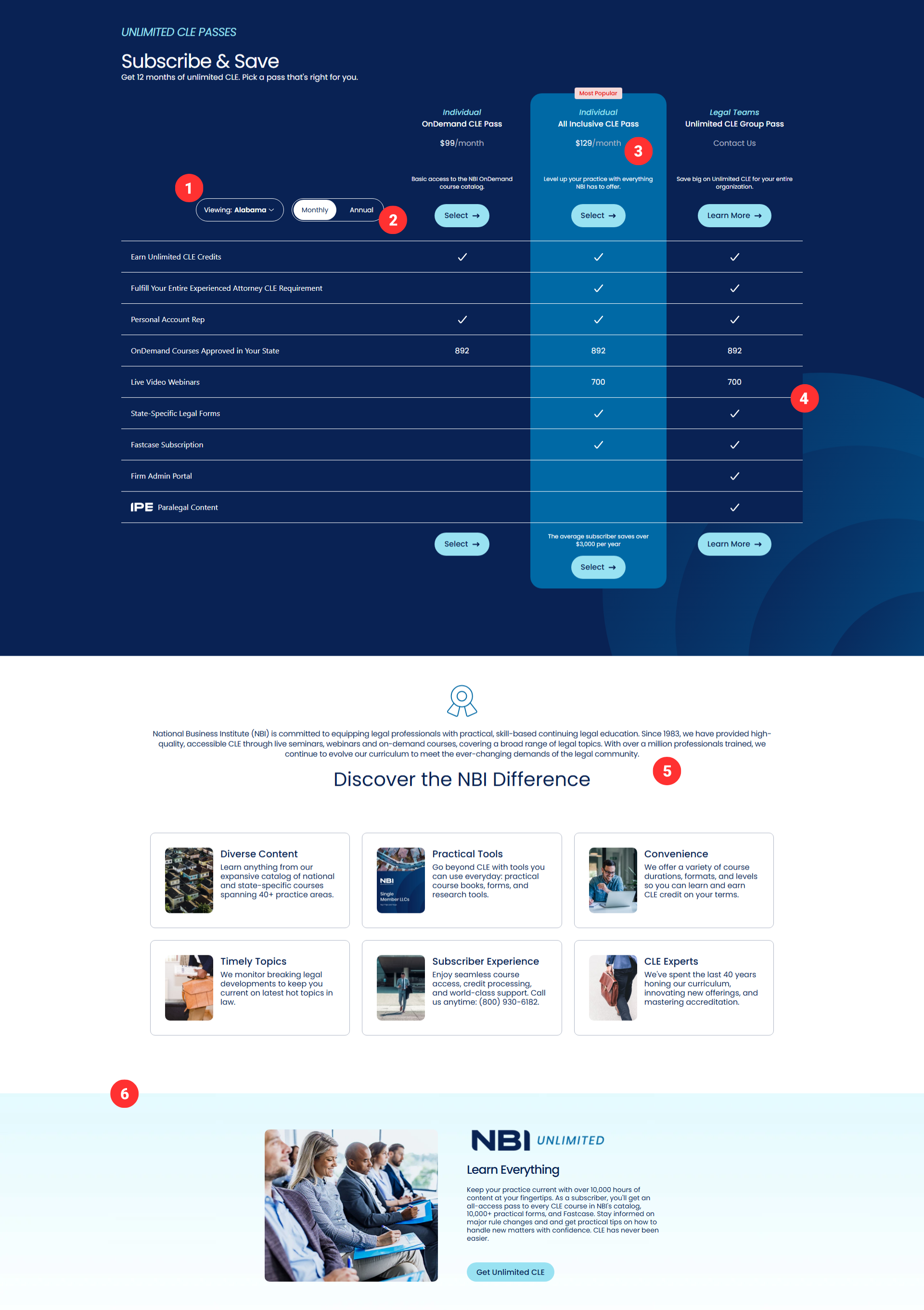
Six friction points killing the conversion.
The original page broke down on execution. Here's what I flagged before touching a single pixel.
Identify. Simplify. Build.
I spotted the problem, connected it to business impact, proposed the redesign, and built it myself.
Audit & root cause analysis
I mapped every element against what a visitor needs to convert: clear pricing, a confident value statement, and social proof. Anything that didn't serve those three goals was a candidate for removal.
Reduce decisions, increase clarity
I removed the state selector entirely and redesigned the billing toggle as a prominent, clearly labeled visual switcher. Pricing moved front-and-center at a size that actually commands attention.
Simplify the plan comparison
Replaced the spreadsheet table with a clean card layout focused on key differentiators. I also added an expandable dropdown on the All Inclusive card — a circle + icon reveals the full list of what's included in the OnDemand pass, so visitors can see everything they get without the page getting cluttered.
Replace filler copy with real credibility
The generic benefits section came out. In its place: real firm logos in an animated scrolling bar, animated counters on the three key stats (40+ years, 100K+ reviews, 1,000+ new courses/year), and testimonials with actual names attached.
Layer in UX details that do real work
Added a sticky CTA that appears as visitors scroll toward the bottom of the page, giving them a direct path back up to subscribe without having to scroll all the way back. Small detail — measurable impact.
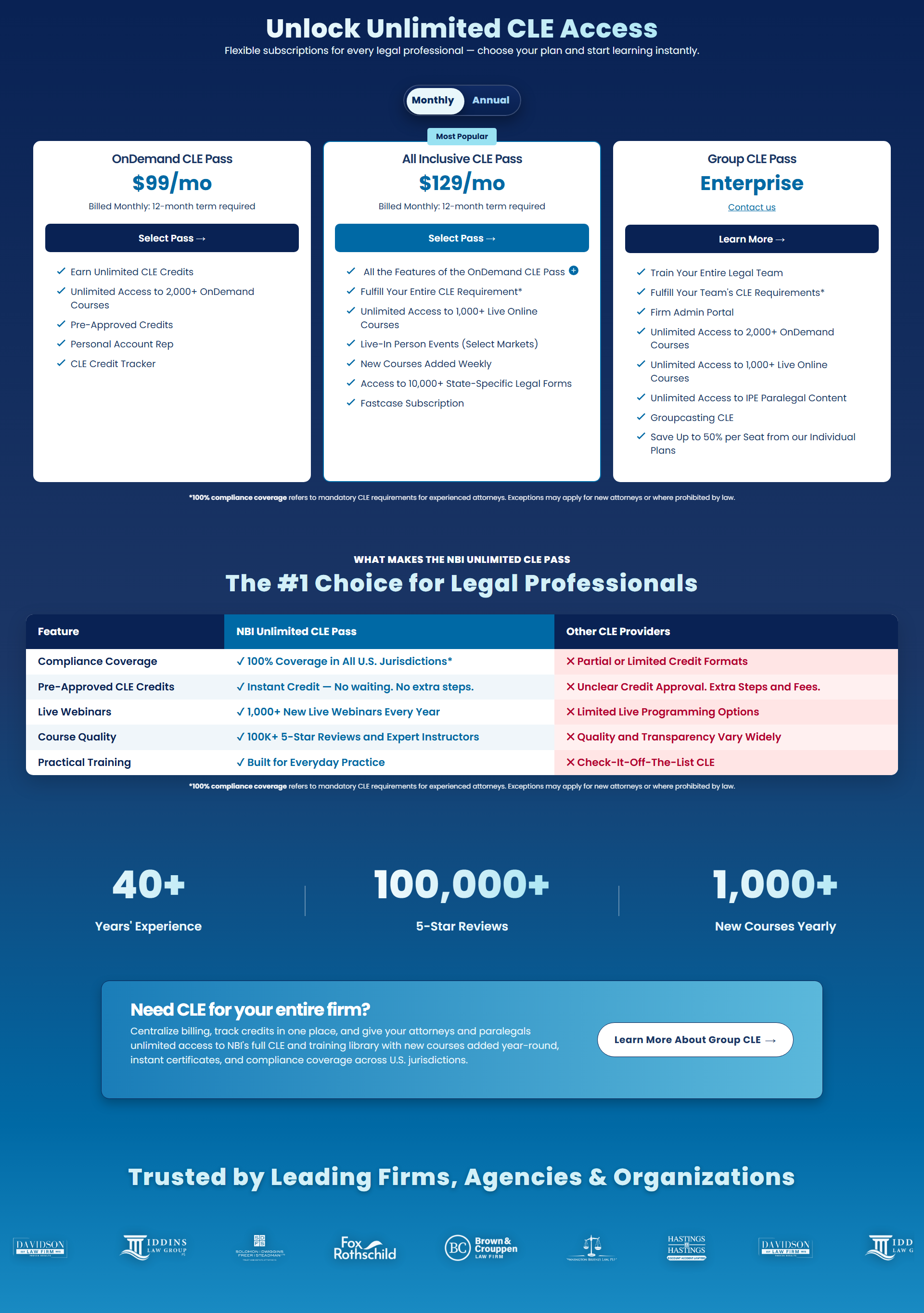
The page did its job.
After launch, the data confirmed what the design logic predicted — less friction, more conversions. Bounce rate dropped, subscription volume increased, and customer service saw fewer billing confusion calls almost immediately. Stripping out the noise and making the page easier to read turned out to be more effective than anything that had been on it before.
Good marketing pages remove decisions. Great ones make the right decision feel obvious.
This project wasn't assigned to me — I identified the problem, built the case, and executed the solution independently. The most impactful marketing isn't always new campaigns or bigger budgets. Sometimes it's fixing the page that's already in front of your customers.