Introduction01
Logo02
Colors03
go where you belong.
Playfair · Syne · DM Sans
Typography04
Imagery05
Applications06
A travel companion for women who go alone — not out of necessity, but by choice.
Solo travel for women is growing fast — wander was built for it.
wander combines safety-reviewed itineraries, community-sourced stays, an offline companion app, and check-in tools that keep everyone informed. Planning that respects your intelligence and your independence. We don't warn. We equip.
Does this give her more freedom, or less? If it adds friction without adding safety, it doesn't belong.
Every stay reviewed by solo women travelers. No affiliate rankings, no paid placement.
We name guesthouses, streets, and hours. Vague advice is useless advice.
Like your most well-traveled friend. Confident, specific, no hedging.
"Users may wish to consider various accommodation options based on their preferences."
Context, not warnings. Trust members to make good calls.
"Be careful!! Women traveling alone should always exercise extreme caution."
Real numbers, real people. Community is the authority.
"Our expert travel editors recommend this highly-rated destination!"
Short, confident, specific. No "wanderlust." No exclamation marks.
"Embrace your wanderlust with our amazing female-focused travel experience! ✈️"
A refined map pin paired with the italic wander wordmark. The icon stands on its own. The wordmark carries the editorial voice.
80px wide minimum. Below this the italic stroke becomes mud.
22mm minimum. Drop the tagline on small formats.
1× x-height on all sides. It's a signature, not a banner.
Don't use all-caps
Don't use upright
Don't set in Gold
Don't change typeface
Always italic, always lowercase, always Playfair Display. On Ember, Cream, or white. Keep the clear space. Let the name do the work.
Never all-caps, never upright, never in Gold or off-brand colors. Never on photo backgrounds.
Night to violet, amber to gold. Every color pulled directly from the horizon at its most dramatic hour.
The darkest depth. Hero backgrounds, app chrome, footer. Holds the whole palette in place.
CTAs, active states, highlights. Use where the eye should land. Never decorative — earn every application.
Safety UI, night mode, after-dark features. The palette's deepest drama — rare, intentional, and powerful.
Playfair for emotion. Syne for structure. DM Sans for function. Each has a lane.
Hero headers, wordmark, pull quotes. Always italic, weight 400–700. The emotional register of wander — graceful and authoritative.
Nav, labels, tags, buttons. Uppercase, tracked. The structural layer — precise and forward without being clinical.
All body copy, app UI, captions. Clean and neutral. Never competes with Playfair. The quiet voice that carries the substance.
Golden hour. Women in motion. Real destinations. Not stock, not posed, not perfect.

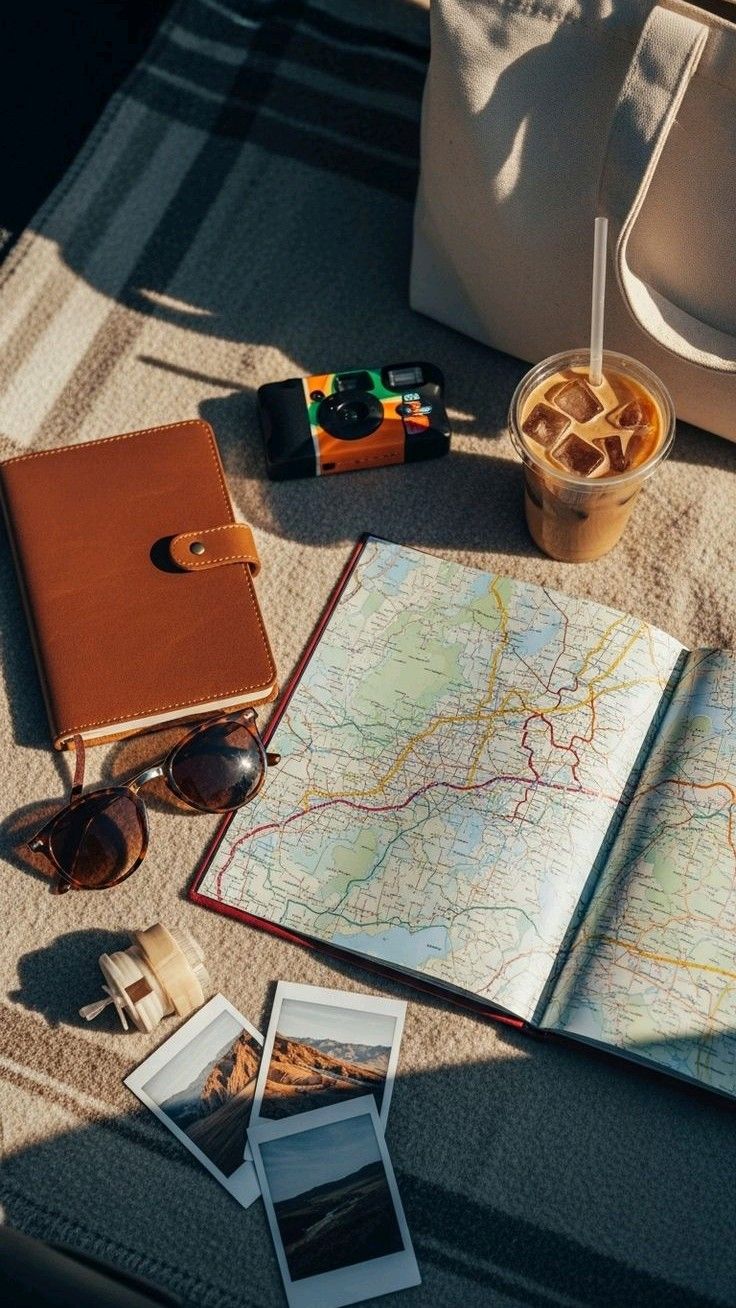
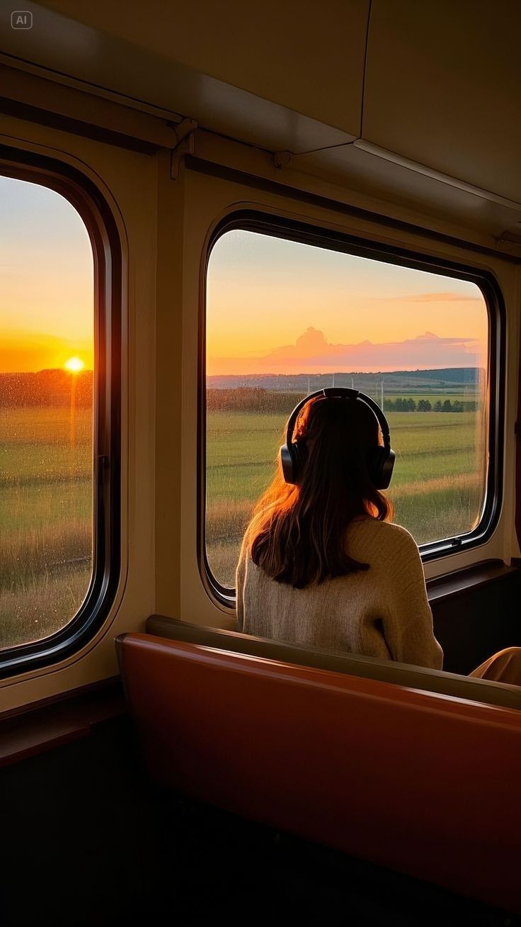
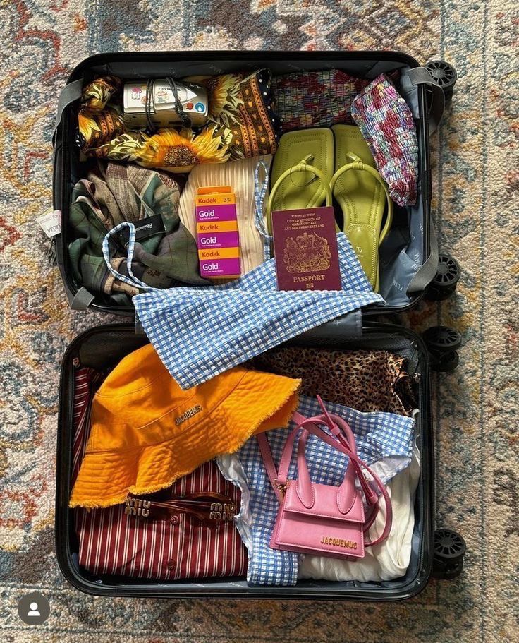
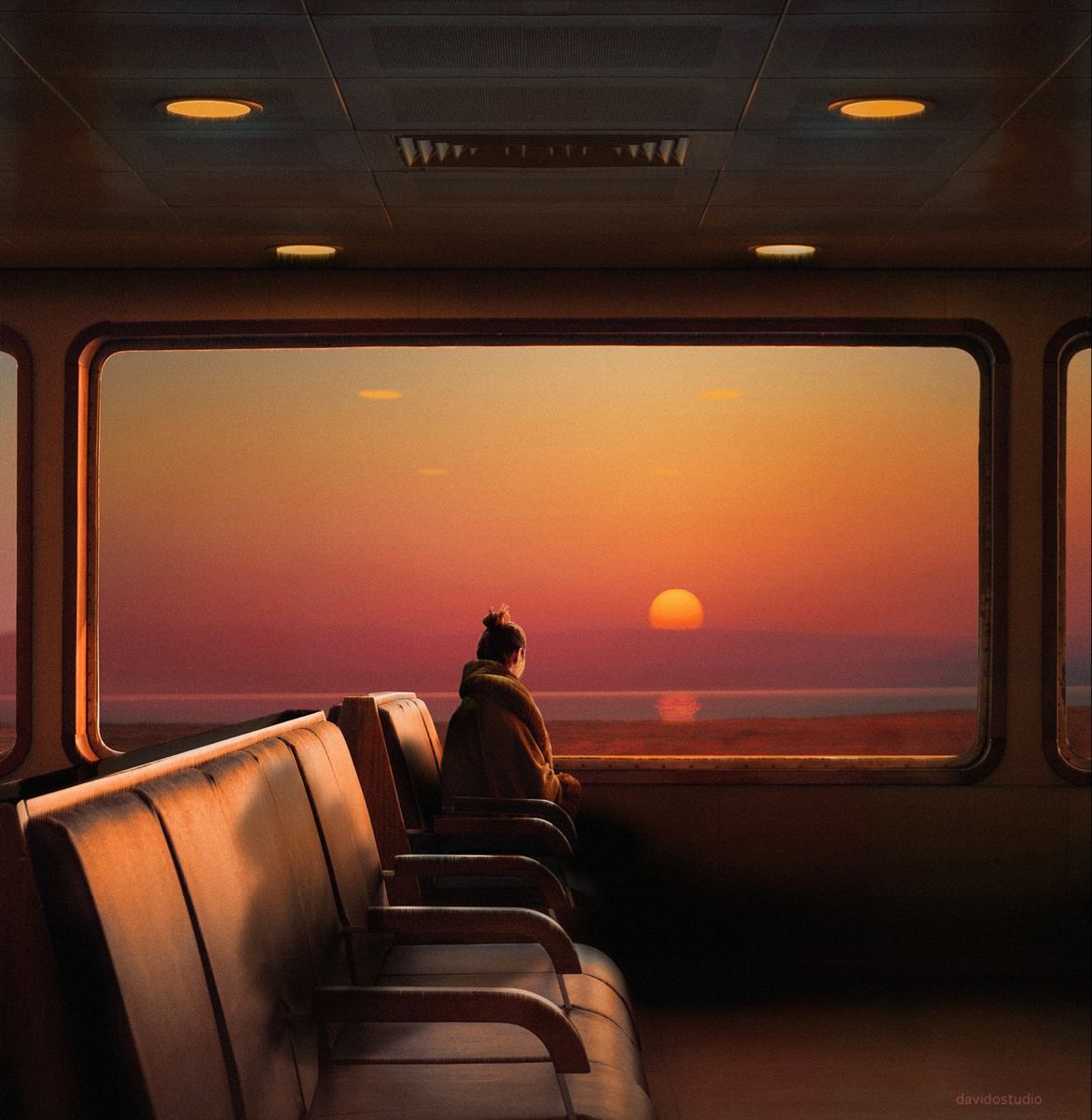
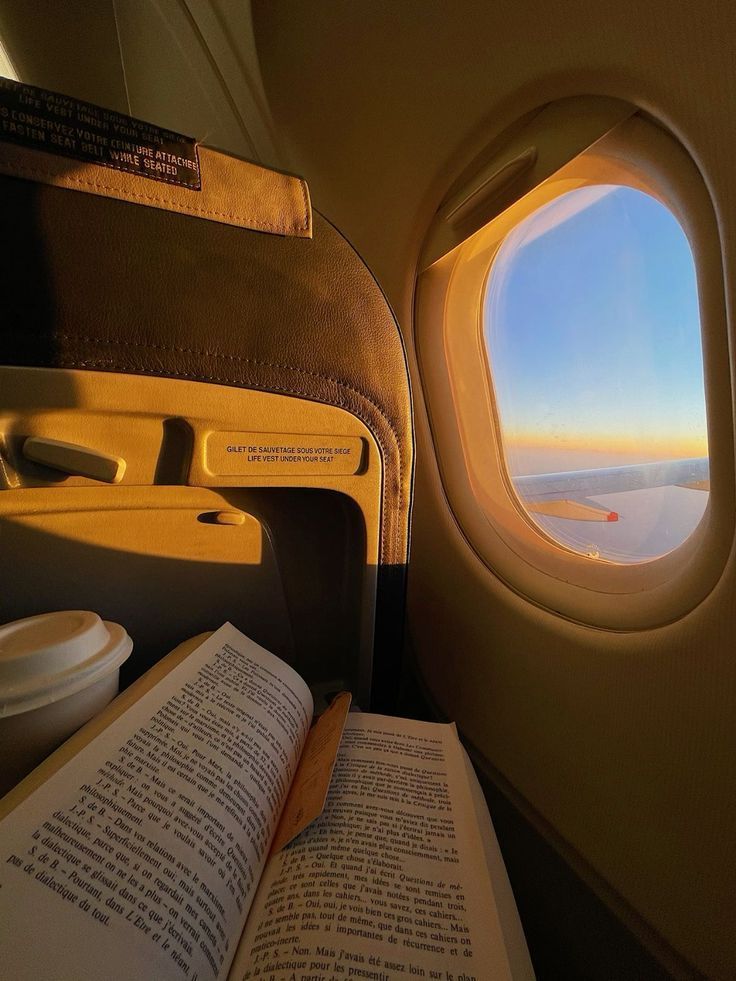
Sunset, lamplight, morning haze. Shadows are welcome. The light should belong to a specific hour.
Looking at the view, not the camera. Never stock-photo composure. Never a group smile to camera.
All ages, backgrounds, body types. If the photo could be from anywhere, it shouldn't be in wander.
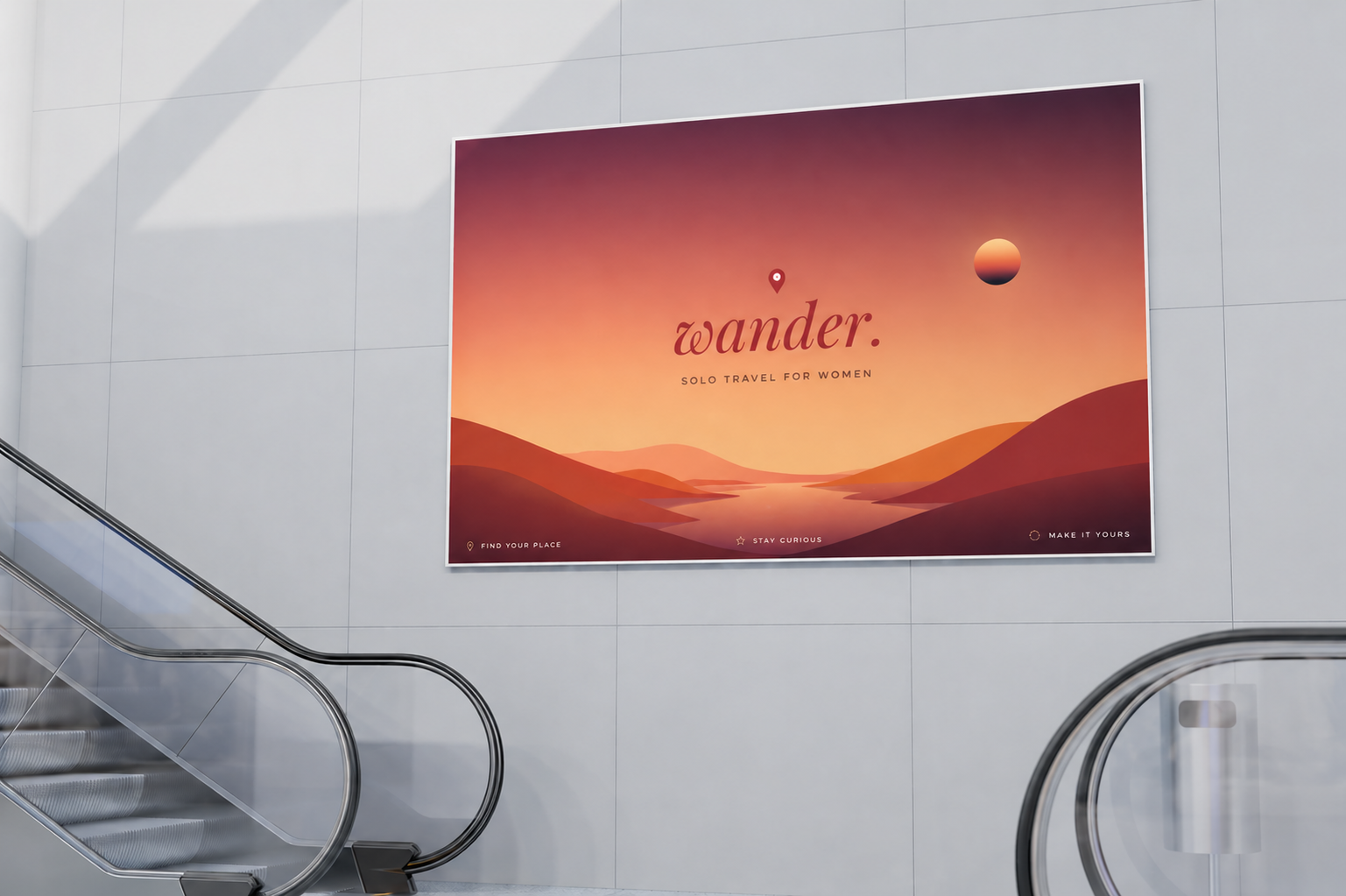
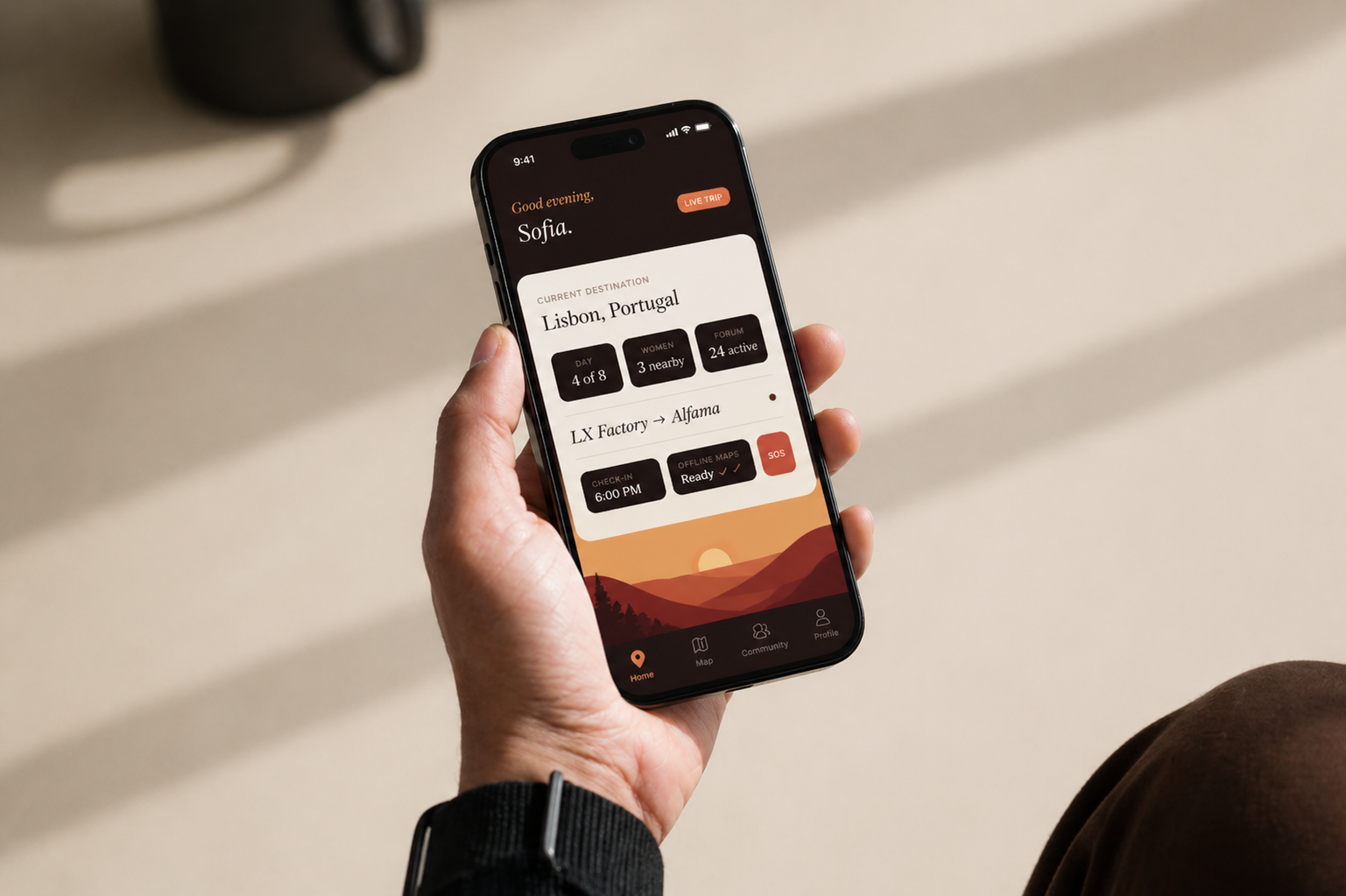
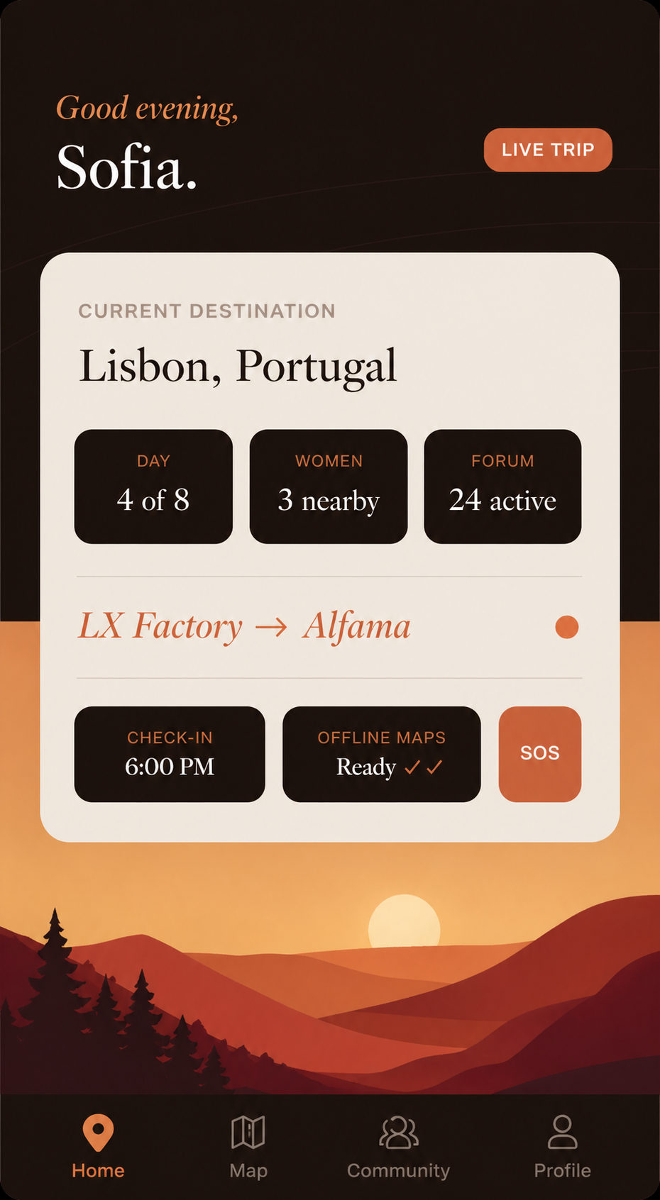
How wander lives on screens, walls, and in people's hands — where the brand becomes something you can feel.