Introduction(01)
NOCTA
Pizza After Dark
Logo(02)
Typography(04)
Colors(03)
Imagery(05)
Applications(06)
Dark hours. Bold pies. A late-night artisan pizza brand built for the city after dark — where indulgence, atmosphere, and craft take center stage.
The city stays up. WE KEEP THE OVEN HOT. This brand book defines how NOCTA looks, speaks, and behaves — from the oven to the streets.
NOCTA — short for nocturnal, built for after dark. A wood-fired pizza brand that only exists between 8PM and 4AM, for the city's creatives, night-shift workers, and anyone who believes the best decisions happen after dark. We don't do lunch. We don't do beige. We don't do sorry.
NOCTA doesn't apologize for the hour. We are the hour. Our brand lives in low light, smoke, and the sound of a city that refuses to sleep.
Every pie is made by hand. Every topping combination is deliberate chaos. The dough is disciplined. The toppings aren't.
Chefs, bartenders, musicians, designers. NOCTA belongs to the people who build the culture everyone else consumes in the daytime.
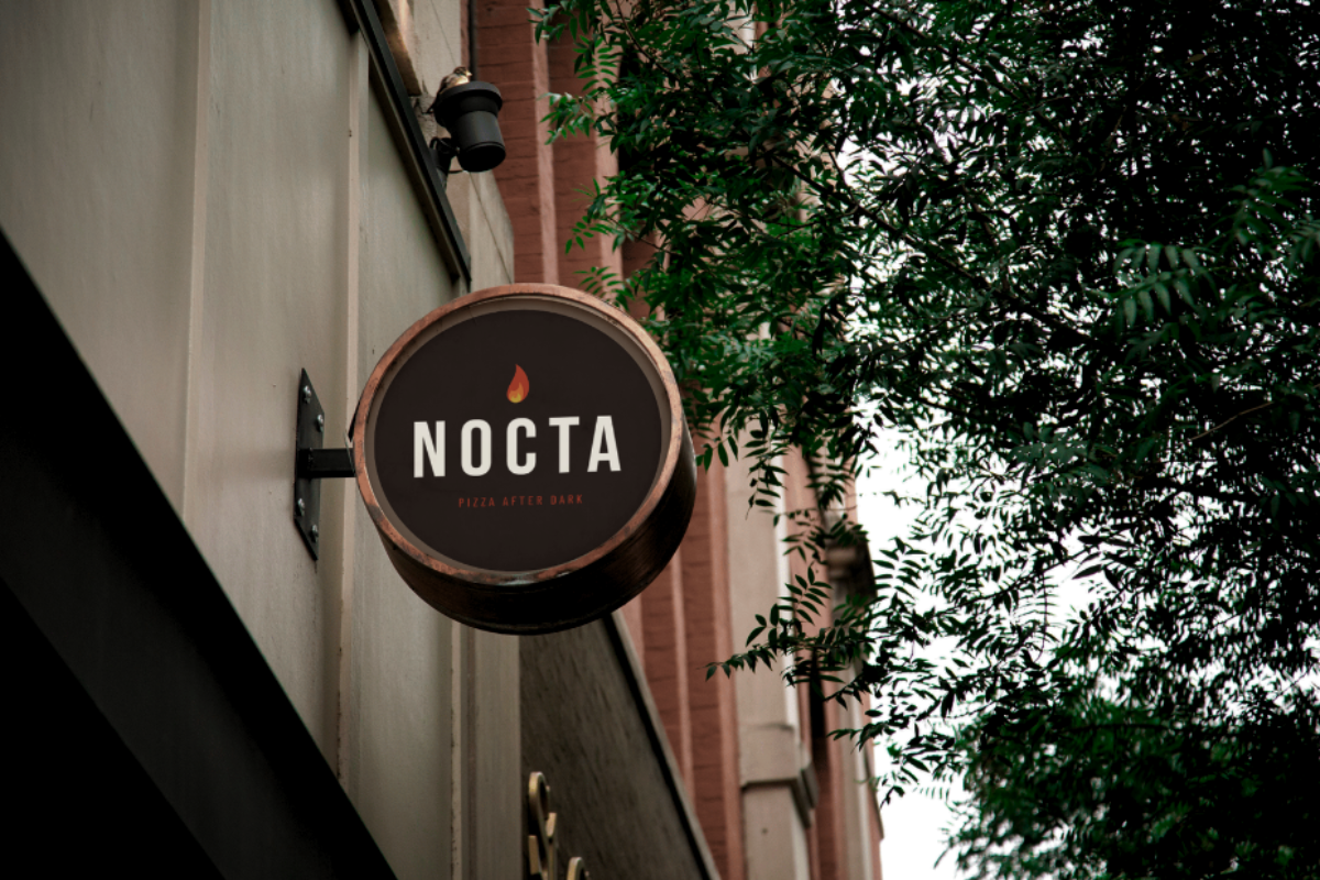
NOCTA in Bebas Neue — all-caps, tight, unmistakable. No symbol, no icon, no tagline required. The name carries its own weight.
Uppercase, always. On Black, Cream, or Red, always. No exceptions, no variations. If it needs explaining, the context is wrong — not the logo.
Wordmark at 72px width minimum on screens. Below this, letterform clarity suffers.
Minimum 22mm print width. On packaging, never below 14mm in single color.
Always 1× cap-height on all four sides, minimum. No adjacent text or elements.
Don't skew or italicize
Don't use wordmark in red
Don't over-space letters
Don't outline or ghost
Always uppercase. Use on Black, Cream, or Red only. Maintain clear space. Lock proportions. Let the name work on its own.
Never skew, italicize, or outline the wordmark. Never place on purple, blue, or photo backgrounds. Never lowercase.
Three near-blacks, one red that cuts through smoke, one gold like a charred crust, one parchment for print. The palette of a wood-fired kitchen at 2AM — scorched, warm, deliberate.
All CTAs, key highlights, box lid stripe. It's the fire in the oven. Use it where you need the eye to go — nowhere else.
Warm, earned, secondary. Use for prices, secondary labels. Never compete with Flame. One warm accent at a time.
Menu backgrounds, receipt stock, flyers, print. Never a dominant digital color — NOCTA lives in the dark.
Bebas Neue shouts. DM Serif whispers with a smirk. Barlow gets the work done. Each has its lane — cross them intentionally or not at all.
All headlines, signage, packaging labels. Always uppercase. Tracking at 0.08–0.18em. Use for anything that needs to be read from across a dark room.
Pull quotes, subheadings, menu category labels. Always italic. Always in Flame or Parchment. The contrast to Bebas — emotion against structure.
All body text, menu descriptions, app UI, captions. Barlow for prose, Barlow Condensed for labels, tags, navigation.
Photography looks like it was shot at 1AM with available light. Warm, imperfect, honest. If it looks too polished, it's wrong for NOCTA.
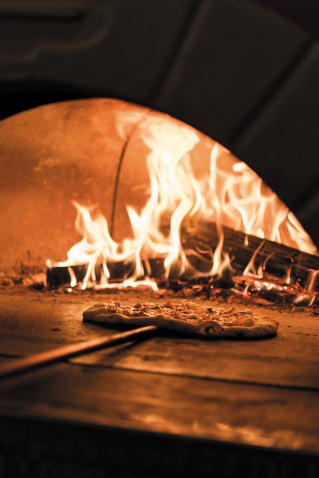
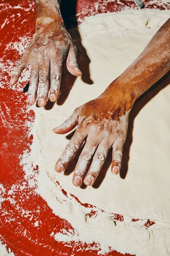
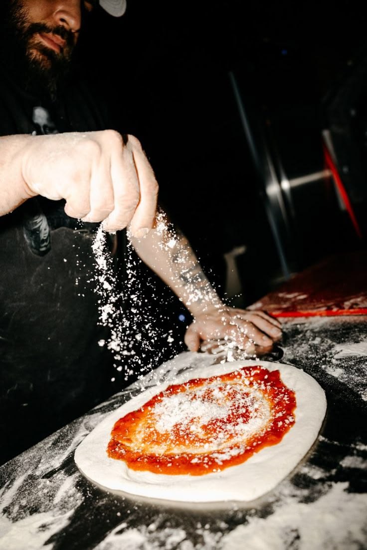
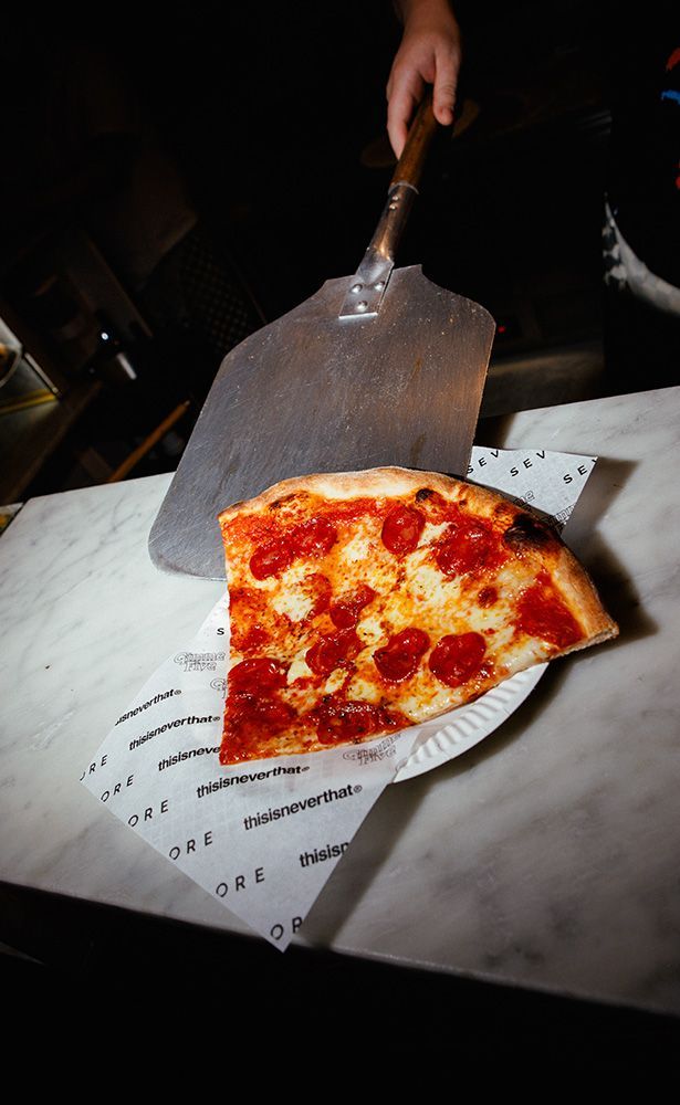
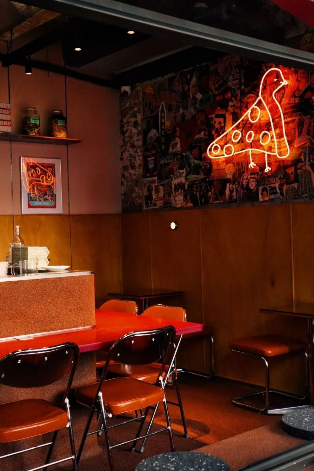
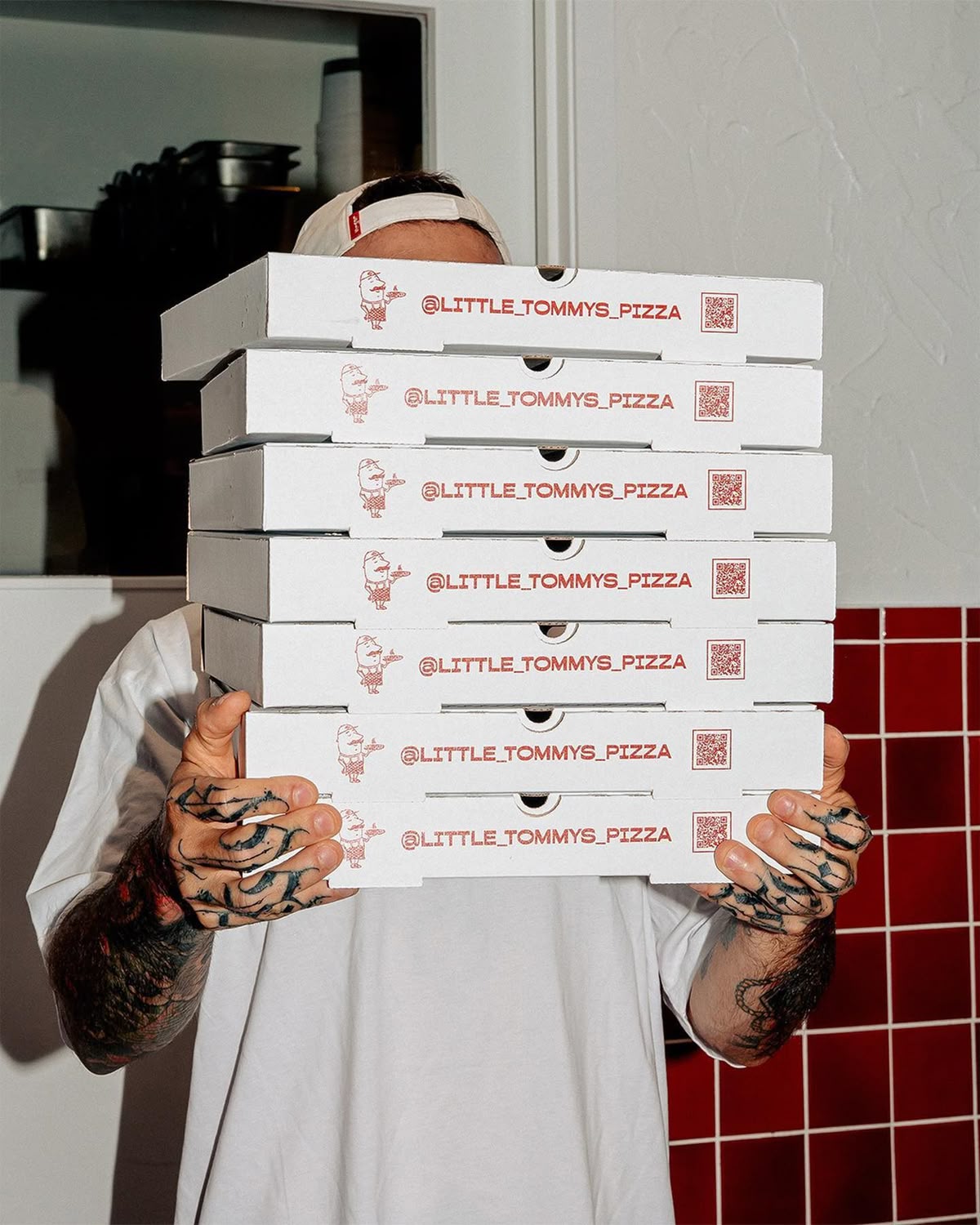
Tungsten, fire, neon. Shadows are welcome. High contrast is on brand. Never use studio-bright overhead lighting.
Browns, reds, near-blacks. The occasional gold from cheese or crust. No cool tones. No food-magazine blue-whites.
Action shots over still life. Flour on hands. A slice mid-pull. The oven door open. Imperfection is authenticity for NOCTA.
This is where NOCTA stops being guidelines and starts being something you can hold, read, wear, and walk past at 2AM.