06 — Applications
Brand in the world
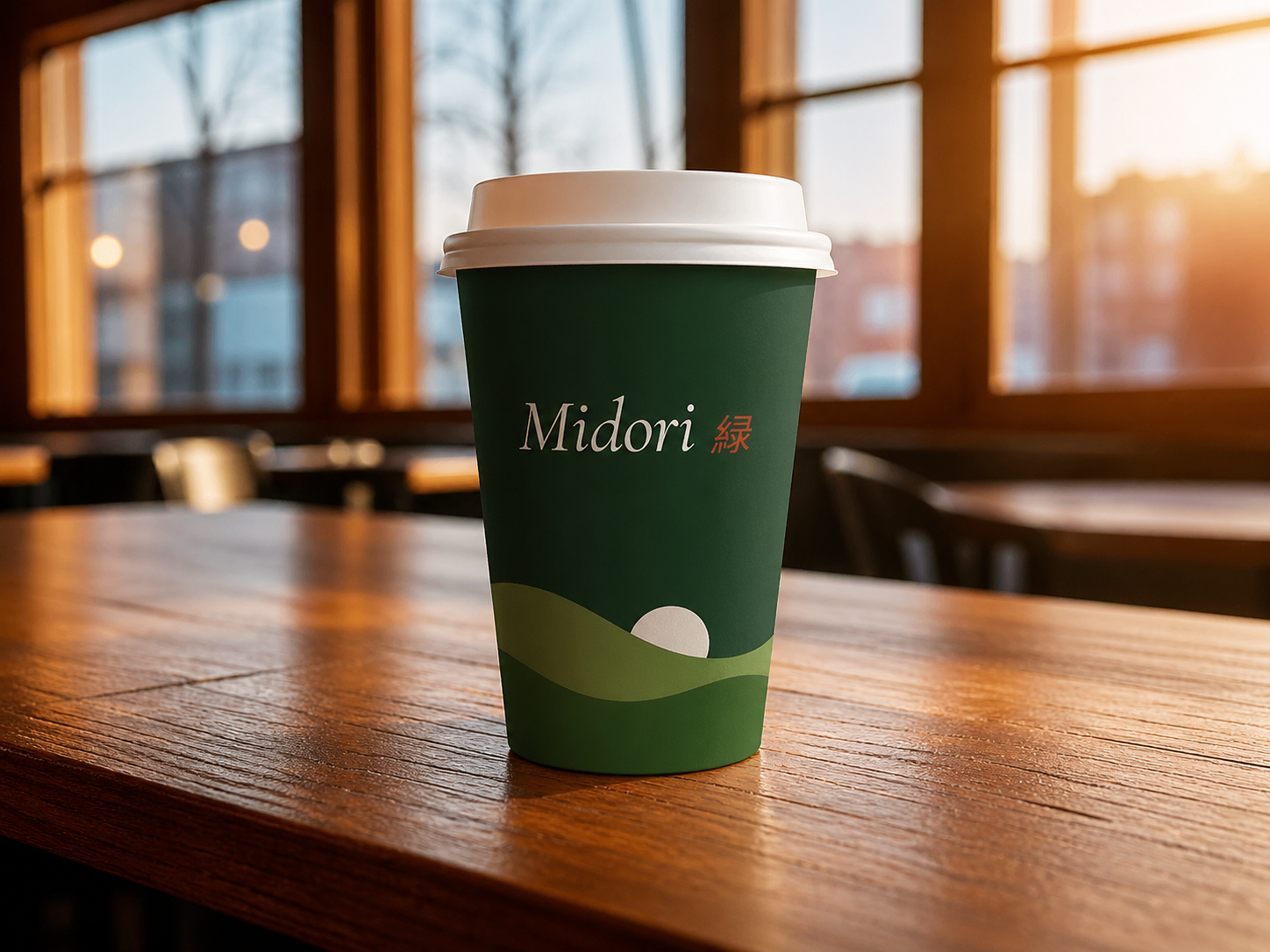
How Midori lives on cups, menus, packaging, and walls — where the brand becomes something you can hold.
A brand built on stillness, craft, and the quiet beauty of ceremonial matcha.
This brand book serves as a guide to ensure consistency and recognition across everything Midori creates — defining the visual and verbal elements so every expression feels unified and intentional.
Midori (緑, meaning green) is a ceremonial matcha bar rooted in Japanese tradition. We believe preparing matcha is a ritual — not a transaction. Every detail communicates calm, craft, and connection.
Visuals breathe. Language is sparse. Space is generous. Midori never shouts — it invites.
From the grade of our matcha to the kerning of our type — nothing is accidental.
Matcha connects people to land, to ritual, to each other. Warm beneath the minimal surface.
One wordmark. MIDORI set in Cormorant Garamond italic, with 緑 in Seal red as a permanent signature detail. No symbol. No icon. Just the name — and what it means.
The 緑 kanji is always red, always proportioned consistently to the wordmark, always present — a signature, not decoration.
Wordmark at 80px width minimum. Never scale below this on screen.
Wordmark at 25mm minimum. Below 20mm use single-color ink only.
Always maintain 1× the cap-height on all four sides. No exceptions.
Don't rotate
Don't stretch
Don't gray out the 緑
Don't use on off-brand bg
Maintain clear space. Lock proportions. Use only on approved backgrounds. Always include 緑 in red at the correct size ratio.
Never stretch, rotate, or recolor the wordmark. Never place on competing patterns or use 緑 in any color other than red or cream.
Six colors and one signature detail. Each drawn from the world of matcha — and one from the Japanese seal tradition.
All CTAs, active states, key highlights. The single warm note in a cool-green world. Never as a full background.
Used only on 緑, tiny signature dots, and packaging seals. Never for buttons, links, or UI states. You notice it second — not first.
Muted gray-blue for captions, timestamps, metadata only. Never as a feature or accent color.
Cormorant Garamond carries emotion, history, and poetry. Outfit handles everything functional with clean precision.
Headlines, hero statements, pull-quotes. Light (300) or Regular (400). Italics preferred. Use for emotion — never for instructions or UI labels.
All body copy, UI labels, menus, captions. Geometric, highly legible at any size. 300 for body, 500 for labels, 600 for UI elements.
Photography should feel like a pause — soft light, green-led palette, unhurried subjects.
Diffused directional light. Soft shadows. No harsh flash. Golden hour for warmth.
Images live in Forest-to-Stem range. Amber ceramics welcome. No cool blues, no neons.
One subject, generous space. Props: ceramic, wood, cloth. Max 3 props. Never cluttered.
How Midori lives on cups, menus, packaging, and walls — where the brand becomes something you can hold.