Brand Identity Guidelines

FINDLY

Curated vintage home décor, sourced with purpose and delivered to your door. Share your aesthetic — we find the pieces that make a room feel like you.

"The find over the new.
Every piece has a past life." FINDLY
In Practice Since Sourcing Since '54
01 — Introduction

Who is Findly?

/fīnd·lee/ — like "find" + "ly" · not "fin-dlee"

"Found, not bought."

Findly curates vintage home décor for people who believe a room should feel found, not bought. Share an inspiration board and a real person sources the pieces — handpicked, secondhand, and deliberately chosen.

Curated Vintage Mid-Century Intentional Warm
01

The Find Over the New

Mass-produced décor fills a room. Found décor furnishes a life. Findly exists in opposition to furniture that arrives flat-packed and forgotten in five years.

02

Personal, Not Generic

Every curation starts with the customer's inspo board. A real person reads it. A real person does the sourcing. No dropshipping, no catalogue, no shortcuts.

03

Mid-Century as a Lens

The aesthetic runs warmly through the 1940s–70s. Organic shapes, earthy tones, materials that improve with age. Not a period piece — a sensibility.

04

Sustainable by Default

Everything Findly sources already exists. No new manufacturing. No virgin materials. The most sustainable piece of furniture is one that already has a life behind it.

Service Tiers + Subscription
Tier 01 · Entry
The Dig
From $85
3–4 curated vintage pieces
Based on your inspo board
Accent items: ceramics, textiles, small objects
Handwritten piece notes included
Tier 02 · Mid
The Haul
From $165
5–8 curated pieces
Mix of statement + accent items
Includes lighting, art, larger objects
Provenance notes + styling suggestion
Tier 03 · Premium
The Archive
From $275
9+ carefully sourced pieces
Rare & designer vintage included
Era-specific sourcing on request
Printed lookbook + full piece histories
★ Sub
Tier 04 · Monthly
The Find
$75/mo
2–3 seasonal accent pieces monthly
Evolving inspo profile on file
Pause or cancel anytime
Priority sourcing access year-round
↻ Subscription
Tone of Voice
Warm & knowing
"We found this in a warehouse in Portland. We couldn't stop thinking about it. Now it's yours."
Specific over vague. Conversational but never casual. Speak as someone who genuinely loves this stuff.
"Beautiful vintage-inspired décor for every home! 🏠✨"
Story-forward
"1962. Danish. Someone put it in storage forty years ago and forgot it was good."
Provenance is personality. Names the era, the origin, the material. Objects have a past — we tell it.
"Great condition item with unique vintage styling, perfect for any décor."
Unhurried, editorial
"There's no algorithm here. Just someone with taste, patience, and a lot of time at estate sales."
No urgency-speak. No "limited stock." Findly's pace is deliberate — the language should match.
"Shop now! Last few boxes remaining — don't miss out!"
Never: trendy, clinical, loud
"Your board said warm and layered. We went looking."
No "aesthetic" as a noun. No "curated vibes." No exclamation marks. Describe things plainly and beautifully.
"Serving major mid-century modern energy straight to your door! 🌿"
02 — How It Works

Simple. Personal. Surprising.

01

Choose your tier

Pick the curation size that fits your space and budget — from a small accent haul to a full room sourcing run. Or go monthly with The Find.

02

Send an inspo board

Drop images, colors, eras — describe the room you're after. The more specific, the better the find. Think moods, not just styles.

03

We go sourcing

Your board goes to a real curator. They hit the markets and estate sales with your vision in hand. Every piece is chosen intentionally.

04

Your finds arrive

Wrapped in kraft paper, with piece notes on each item — origin, era, material, why it was chosen. Unbox it. Put it somewhere good.

04 — Colors

A palette of warm rooms

Teak wood, burnt orange tile, aged ceramic, olive drapes. The palette of a well-loved mid-century living room — earthy, grounded, and deliberately warm. No cool tones. No grey.

Deep Brown#2C1A0EBase dark
Burnt Orange#D4611APrimary accent
Teak#8B4A20Mid warm
Parchment#F5EDE0Base light
Forest#2E4030Contrast accent
Gold#C8A040Use sparingly
Usage Ratio
40%
26%
18%
10%
4%
Parchment 40% Deep Brown 26% Burnt Orange 18% Teak 10% Forest 4% Gold — sparingly
Animal Print — Decorative Use Only
Leopard

Background textures and overlays at 8–12% opacity. Warm #8B4A20 clusters on Parchment or Orange-light only.

Backgrounds · Texture layers · Never on text
Zebra

Warm brown-on-cream stripes — never black-and-white. Editorial dividers and packaging accent strips. One use per layout maximum.

Dividers · Packaging strips · One per layout
Cheetah

Dark brown dots on warm brown. Reserved for the Archive tier only — lookbook print and premium packaging.

Archive packaging · Lookbook print only
Orange is the signal

All CTAs, key labels, nav accents, packaging stripe. It's the warm terracotta tile. Use where the eye needs to go — nowhere else.

Forest is the contrast

Used sparingly for the Archive tier and sustainability messaging. The cool to the warm. Maximum one green element in any composition.

Gold is the finish

Price points, premium labels, the Archive tier accent. The glint of a brass lamp in afternoon light. Use it to signal quality — not quantity.

05 — Typography

Slab, italic, clean.

Alfa Slab One for display presence. Cormorant Garamond for editorial soul. Josefin Sans for legibility and structure. Each has a lane — cross them intentionally or not at all.
Display XLTHE ROOM THAT ALREADY KNEW YOU.
Accent"found in a Portland warehouse. 1962. Danish."
HeadingThe Archive Tier — Premium Curation
BodyA walnut side table, circa 1955. The patina on the top is original — someone drank their coffee here every morning for thirty years.
LabelTier 03 · Archive · From $275
Display — Alfa Slab One
The Find Over the New

All headlines, packaging, campaign text. Always title case or all-caps. The slab serifs recall mid-century signage and print advertising — bold, authoritative, warm.

Accent — Cormorant Garamond
"every piece has a past life."

Pull quotes, piece descriptions, stylist notes. Always italic. Always in Burnt Orange or Brown. The emotional counterpart to the display weight.

Body — Josefin Sans
Josefin Sans 400 — body copy
Sans 700 — UI labels, tags

All body text, product descriptions, website UI, order information. Clean geometric structure against warm parchment backgrounds.

Never use
Script or handwritten fonts
System fonts (Arial, Georgia)
Cormorant in non-italic
Two display fonts together
Alfa Slab in lowercase
Josefin in light weight for headers
06 — Imagery

Warm light. Real texture.

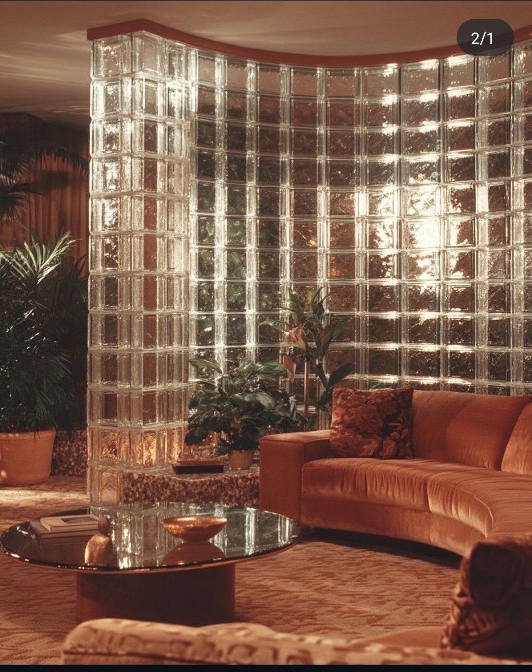
Photography looks like it was shot on a Saturday morning in someone's actual living room. Amber light, linen surfaces, things slightly out of place. If it looks like a catalogue, it's wrong for Findly.
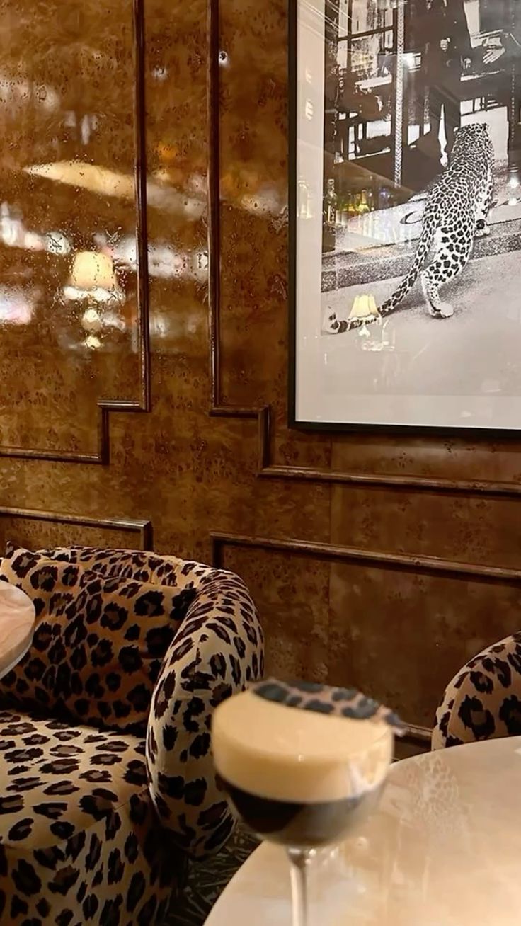
Leopard print sofa, burl wood wallsBurl wood + animal print
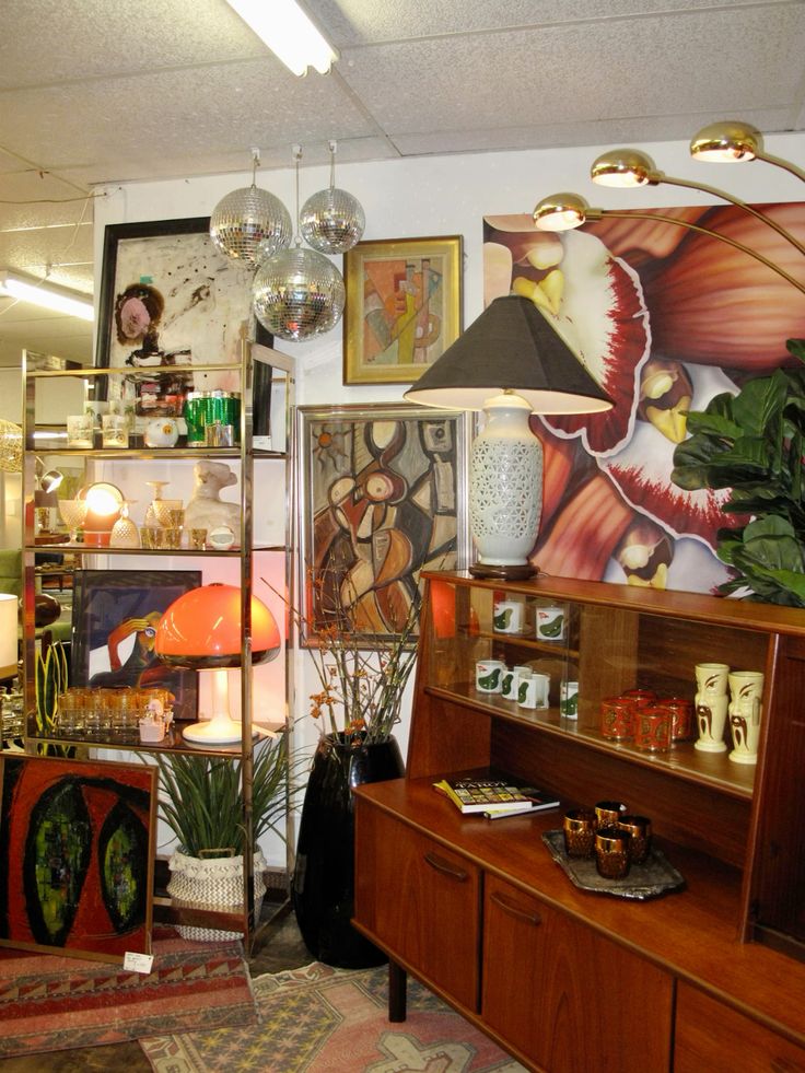
Vintage MCM store with teak furniture and lampsThe find at the source
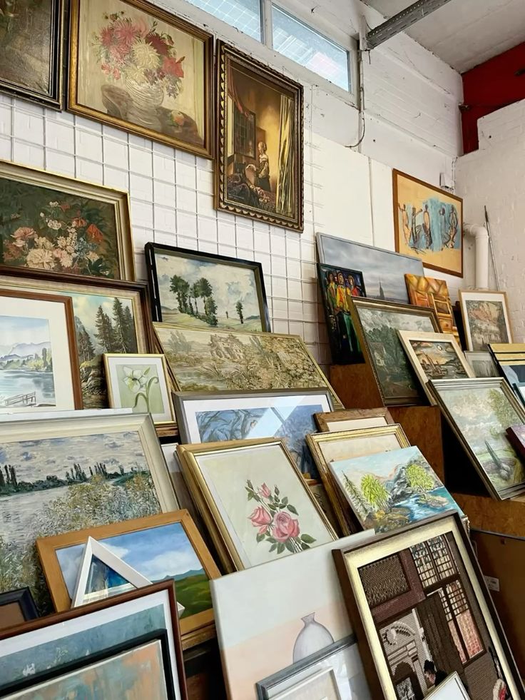
Estate sale paintings stacked against wallEstate sale art wall
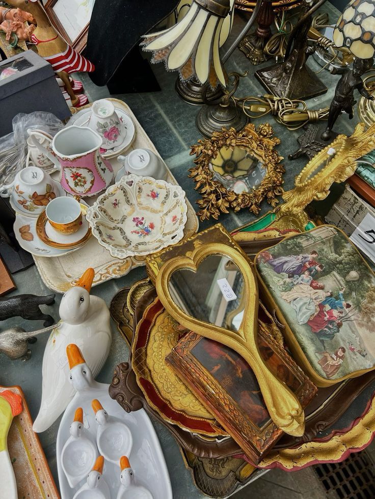
Flea market ceramics, gold frames, vintage objectsCeramics + gilt objects
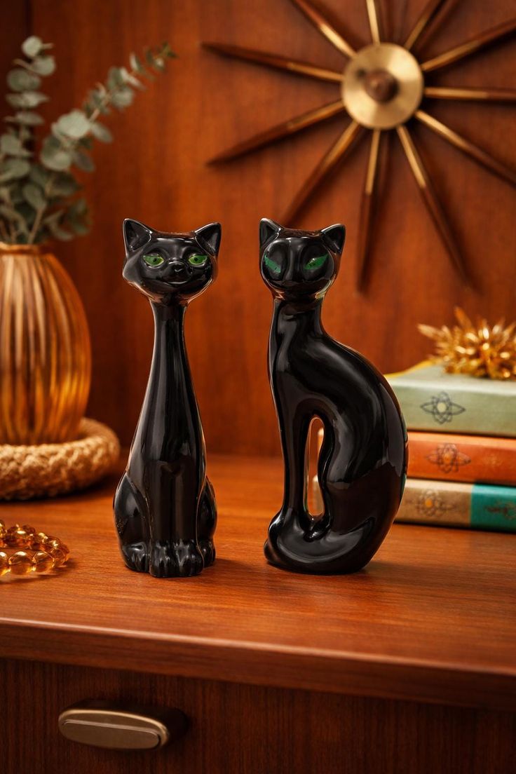
MCM black cat figurines on teak dresserSculptural MCM objects
70s living room with glass block wall, velvet sofa70s amber warmth
01

Amber & warm

Morning window light, tungsten lamps, golden late afternoon. Warm grading always. No studio lighting, no cool-toned overexposure.

02

Tactile & close

Shoot close enough to feel the grain of teak, the weave of a throw, the glaze of a ceramic. Texture is the product — show it.

03

Contextual, lived-in

No white studio floors. Objects in real rooms, on linen surfaces, with natural context. A room in use looks better than a room on display.
07 — Applications

Brand at the doorstep

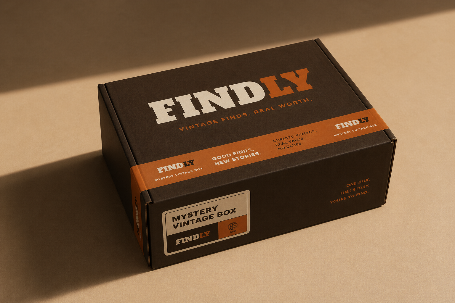
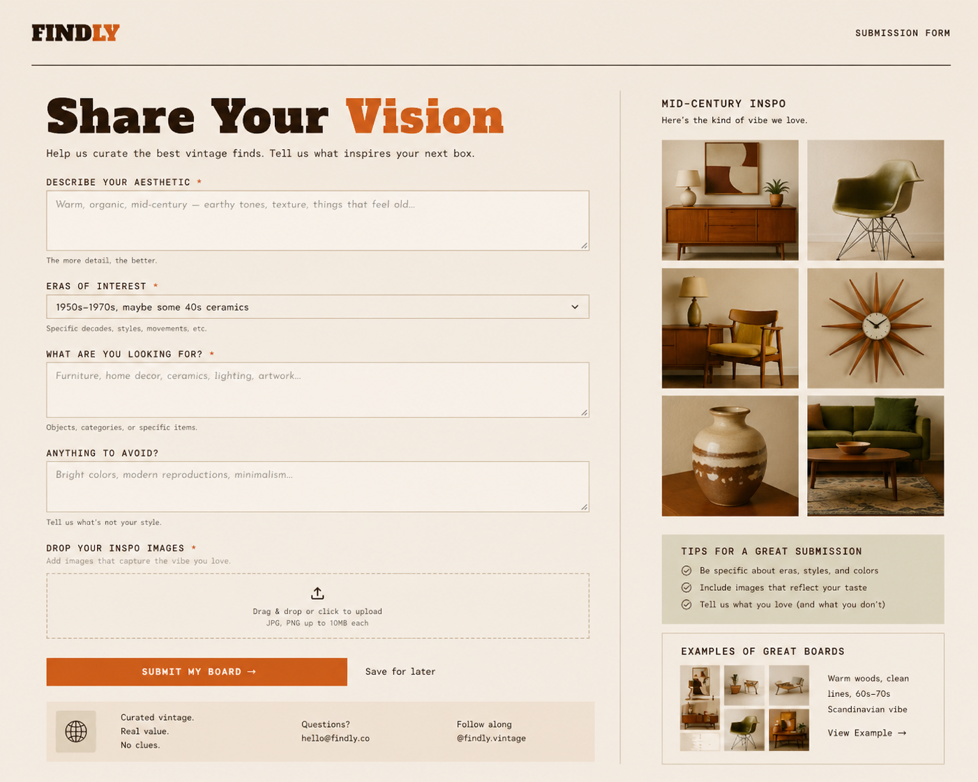
Where Findly lives — the box on your doorstep, the inspo form you fill out on a Sunday, the piece tag tied to a 1962 lamp, and the catalog card you keep on the shelf.

Findly delivery box mockup
Delivery Box — The Unboxing
Kraft paper, handwritten piece notes, and the weight of something real — the box is the first thing the brand asks you to feel.
Findly inspo board submission form
Inspo Board Submission — Web Form
A form that asks for images, not checkboxes — because the sourcing starts with a person reading your board, not an algorithm processing your inputs.
FINDLY
00Overview 01Introduction 02How It Works 03Logo 04Colors 05Typography 06Imagery 07Applications
View More Brand Work → ← Back to Portfolio